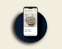
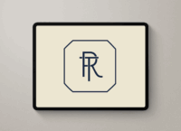
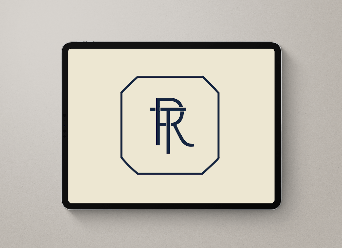
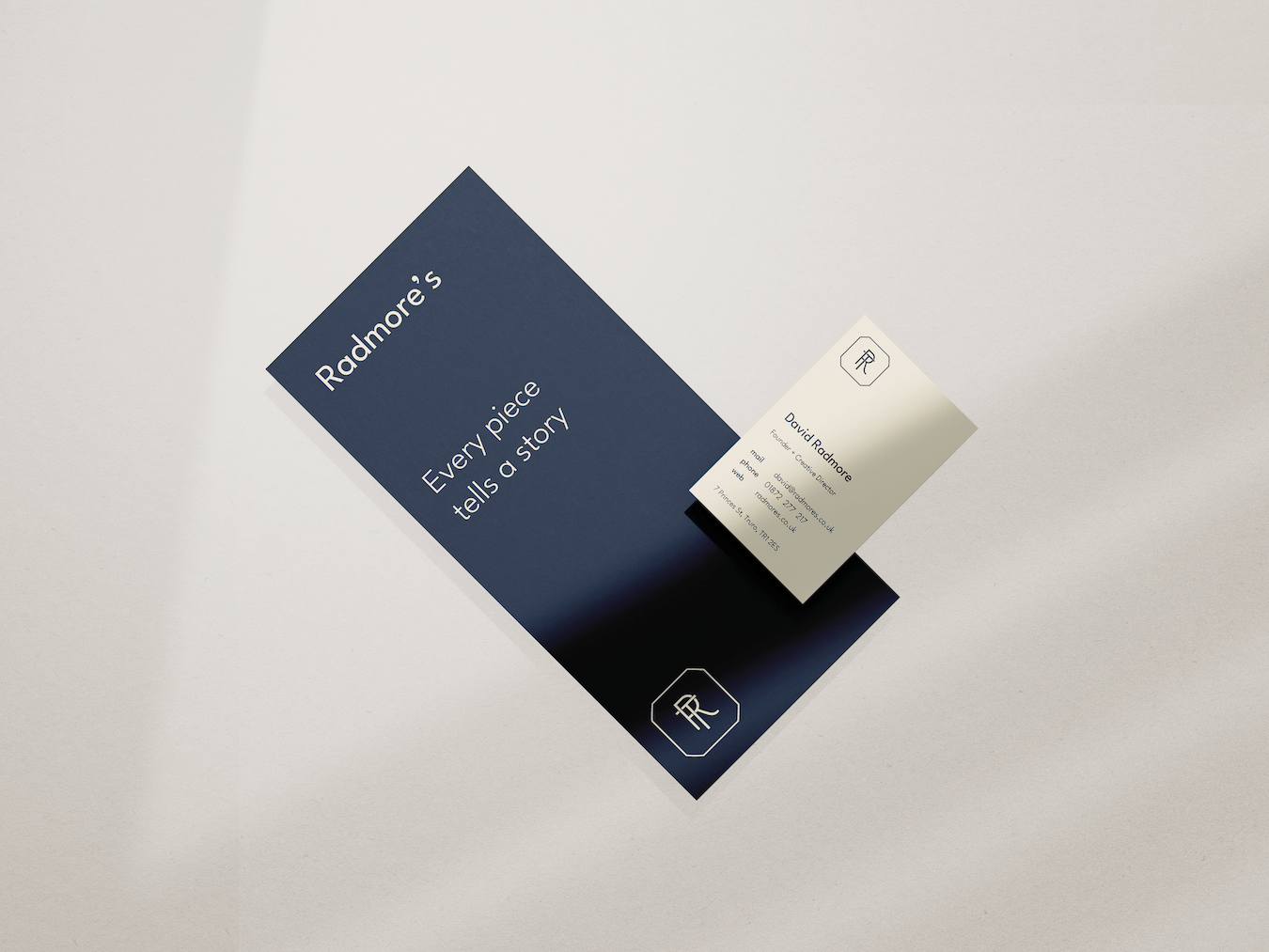
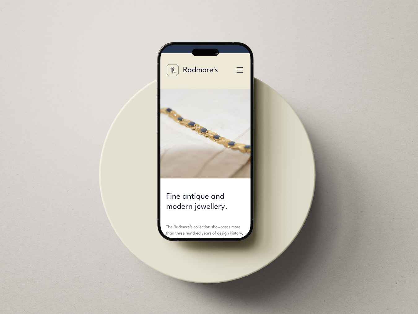
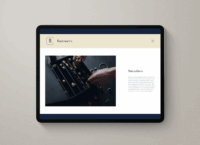
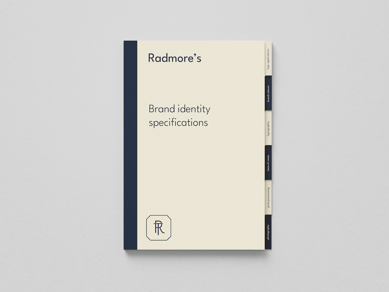
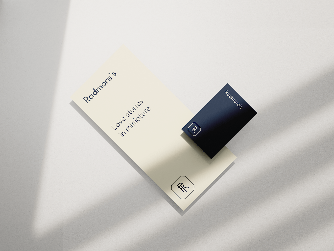
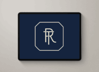
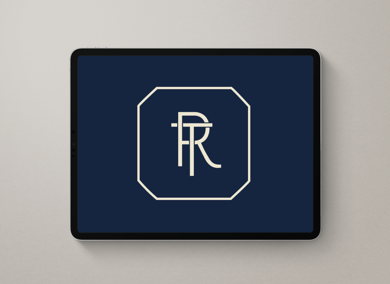
This identity redesign positions Radmore’s Antique Jewellery as a brand defined by traditional goldsmithery, art history, and the belief that ‘every piece tells a story.’ The typography, set in Mr. Eaves, has an approachable, contemporary feel, complementing the company ‘hallmark’ by reimagining traditional forms through a twenty-first-century lens. The design programme incorporates a rich colour palette of ‘Emerald Blue’, ‘Antique Gold’, and ‘Mother of Pearl’ that evokes timeless luxury, enhancing the aesthetic appeal of each piece. The copywriting is emotive and narrative-driven, bringing each piece’s artistry and purported connection to the wearer to the forefront. The result is a warm and inviting brand presence which makes collecting jewellery with Radmore’s feel personal and meaningful.