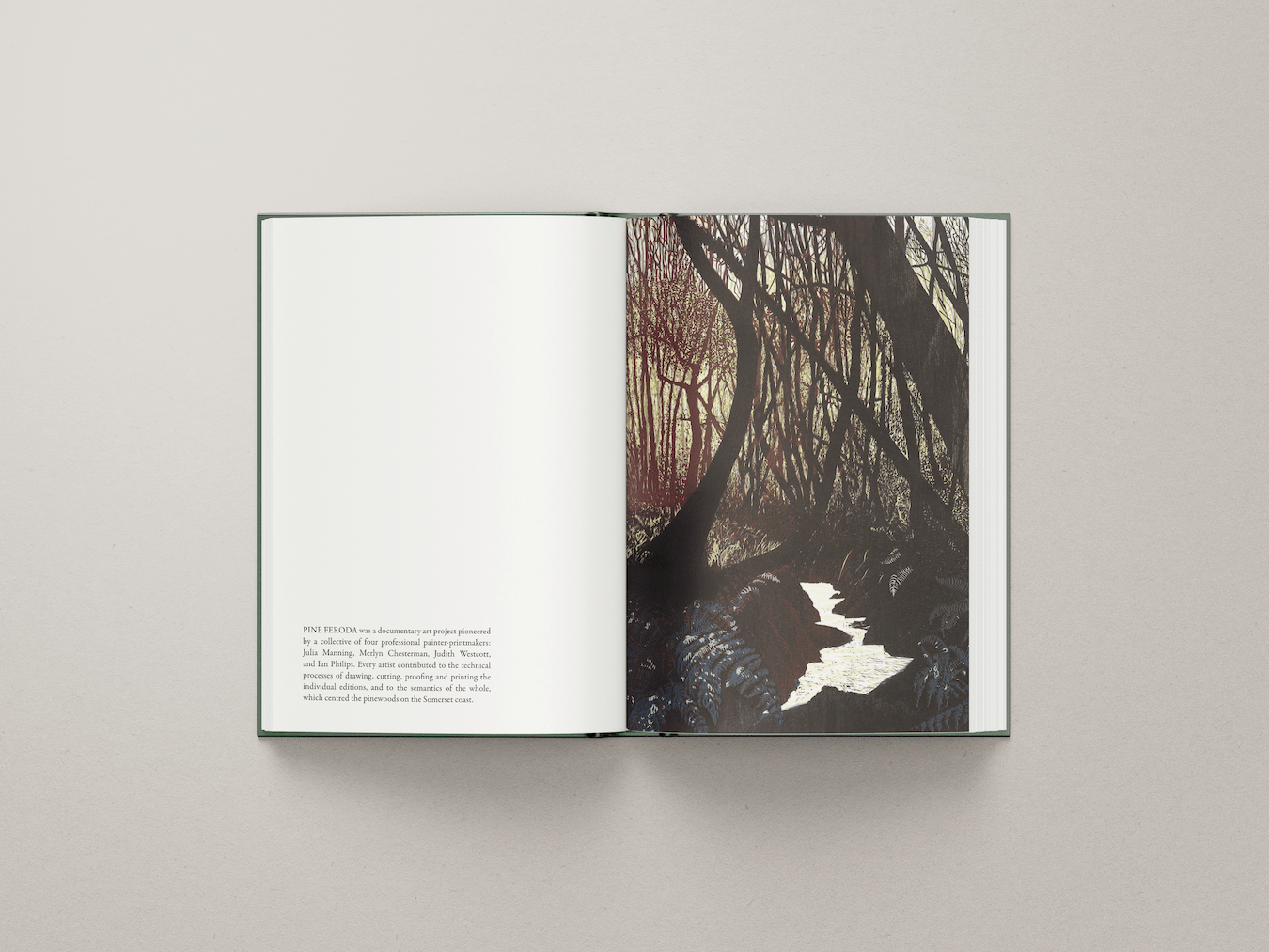
This design-led approach to public relations emphasises the depth and texture of Julia Manning’s printmaking, bringing the Anthropogenic emphasis of her exhibitions to the attention of the press. The typography is lightweight and structurally defined, allowing the artwork to dominate the page while maintaining clarity. A rich forest-green palette, inspired by Julia’s own compositions, unifies the design, ensuring consistency across all materials. The copy – initially composed for exhibition captions – is both informative and evocative, providing an accessible yet thoughtful interpretation of each piece’s ecological commentary. The result is a harmonious publication where text and image work together, enhancing the depth of the narrative and showcasing the artist’s commitment to conservation.